WORCA
Redesigning a Recruitment & HUMAN RESOURCE company’s Website to better connect with users and the market.
Scroll ↓
BACKGROUND
The Client:
Worca is a global human resources and recruitment company that helps other companies hire top tech talent across the globe. They offer full-service capabilities including recruitment, onboarding, payroll, employer of record, and HR solutions to effectively manage every aspect so companies can focus on growing their business. I worked with members of their executive team to design solutions for this project, including the Vice President of Sales, US and the Business Development Analyst, US.
The Objective:
Redesign parts of the client’s website to improve the user experience to reduce pain points, create clearer messaging, and ultimately increase user conversions into new clients.
Deliverables:
Conduct a research analysis of Worca’s target audience
Prepare a design recommendations including a prototype for Worca.io’s website
Research
Research Goals:
Learn about Worca and those who benefit from using their services.
Understand the current customer experience to identify Worca’s value and potential pain points.
Key Questions:
What is the current experience like on the website? Where do users potentially drop off?
What is attracting users to use Worca over their competition?
Research Performed:
Stakeholder Interviews
User Interviews
SCAMPER Exercise
Competitive Analysis
Competitive analysis
One of the questions asked in the interview with the interview with the stakeholder was to discuss who they believed their competitors were in the market. It is important to be aware of your competitors to understand where your company’s niche is in the market. Not only that, but it can really help to discover areas where you exceed and where there are opportunities are for improvement.
(click image to the right for full size)
Interviews
Performing the research consisted of first meeting with the stakeholders to gain a better understanding of the company and their goals. While the project brief provided the high level summary of what the client is looking for, getting to spend direct time with the client really helps to further understand their point of view, what they are about, and what they want to achieve. The client provided a list of existing clients that could be contacted for user interviews.
User interviews were then conducted to get insight on their experiences and any pain points they had. While the clients know what they want to achieve, they may not always realize some pain points or experiences that the user is currently experiencing. Interviewing a user directly helps to shed some light on this and provide more detail so that more suitable solutions can be created. One of the most reoccurring pieces of feedback received during these interviews was the high level of service being received and the connection the clients were making with their users. However, that wasn’t being fully highlighted on the website, there wasn’t really a way to connect with who the company were. This was one piece of information I wanted to make sure was included in the solution.
SCAMPER EXERCISE
I wanted to spend some time on the client’s website to experience it for myself. The SCAMPER exercise is great way to brainstorm ideas for problems or pain points that are uncovered.
Key Research Takeaways:
The current clients are very happy with the level of service they receive.
Some users have a misunderstanding of what services Worca offers.
The pricing page is confusing.
The website could offer more ways to show its’ value and build trust with the user.
The website offers a lot of information to the users, but the navigation can make it difficult to find and understand certain information.
After meeting a second time with the client, I learned they wanted to provide market insights for the user on their platform.
FOCUS
After research concluded and speaking with the stakeholders, it became apparent there were 3 main areas to focus on for the website. This included:
Site navigation
The client’s had great information on the site, but the current setup made things difficult to find and messaging was unclear, which can cause users to drop off quickly. I want to simplify the steps to take users from beginning to end of the user journey through clearer direction and added communication.
Pricing Page
The pricing page in its current state left users confused and unsure of what they were getting without speaking to someone from the company directly. Building a clearer pricing page will help to eliminate that confusion and even create a more interactive experience which can engage the user.
Market Insights
A direction the company wants to move into as they see a clear need in the market. The goal is to design a platform that will become the trusted go to source for insights in the global hiring market.
Design Evolution
Based on the research, I brainstormed some ideas by completing initial wireframing of the different pages of the websites I wanted to update. The goal here is to get ideas to paper and to focus on things like structure, hierarchy, and content placement. These initial sketches help me explore multiple design possibilities and generate an array of ideas.
LOW FIDELITY WIREFRAMES (click to zoom):
Once these initial wireframes were completed, it was time to get feedback. This feedback allows me to identify any usability issues or design improvements that need to be addressed. At this initial stage, everything is very rough. The main thing is to make sure these design ideas convey the ideas I was looking to incorporate.
For the home page, I see that as the main opportunity for Worca to sell themselves to the user and show them why they deserve their trust. I thought this would be a great opportunity to include a short 2-3 minute video talking through who Worca is and what they are all about. I also wanted to include testimonials from other companies and users to further establish that trust.
On the pricing page, it is all about clarity and walking the user through the process. Worca has many different services they offer and many are pick and choose. This can make things complicated to showcase them to the user so they do not get confused as tiered pricing structures. I had an initial idea of a ‘build a bundle’ type idea, which was something I really wanted to explore.
The market insights page I felt needed categories. For something like talent recruitment and HR services, it is possible to get companies who are already very familiar with it, or those who are going through it for the first time and need to start at the beginning. Therefore, I wanted to explore different ideas of breaking the content up by categories.
After rounds of brainstorming and receiving feedback on the initial ideas, I began to develop more high fidelity wireframes to see how these ideas could be implemented.
HIGH FIDELITY WIREFRAMES (click to zoom):
With the high fidelity wireframes completed, the ideas were really starting to take shape. On the homepage, I was starting to narrow in on the overall layout and hierarchy. The stakeholders were very excited to introduce the market insights part of the platform, so I wanted to make sure that got included on the page. I also wanted to create a section that would quickly showcase the difference in value you would receive from Worca over their competition. The pricing page I incorporated highlighting for the build a bundle section. I wanted to make sure it would be clear which services the user selected to get an accurate reading on price. On the market insights, I knew I wanted to have a section for someone to learn the basics of the industry. A ‘101 class’ if you will. It was also apparent to include a featured or trending section, to help users easily find any important or breaking news going on in the industry.
From here, it was time to get into the site navigation and to get into prototyping the design ideas.
SITE NAVIGATION
Before I could start to brainstorm ideas on how to improve the site navigation, I wanted to understand the user flow on the site. Why is the user visiting the website? What tasks are they trying to achieve?
To do so, I created a user objective flow map with four of the top reasons someone would visit their website.
OLD DESIGN
The current navigation bar was basic, and added no insight to properly direct the user. During the research process, both users and myself were getting confused on where to click, or what a certain section meant. It created a lot of back and forth trying to find the section I was looking to get to. This lead me to the idea to add short, descriptive text for each link in the navigation bar. That way, whether the user was experienced on the topic, or new to everything, they could quickly understand where each link in the navigation bar would direct them.
Messaging on the homepage also felt confusing. Users weren’t clear as to exactly the type of company Worca was and the services they offered. The main area of the landing page gives an opportunity to provide your ‘elevator pitch’ about the company. I believe this is the perfect area to incorporate a short video offering more information about the company.
Based on feedback from the stakeholders, it was also clear that the experience for users who are looking to be recruited would be very different from everyone else, so a different landing page made the most sense for them. However, I still wanted to find a way to incorporate a way for them to directly access that side of the website from the navigation bar.
Solution
Main navigation bar old design:
New Design:
As you can see, overall is has a similar feel, however the navigation bar has been revamped to be streamlined and provided clearer options on how to direct traffic. Features include:
How it works - The how it works option is a new addition to the navigation bar so that anyone knows exactly where to go to better understand Worca and the services they provide.
Solutions - Combining services offered and examples of ‘who we serve’ into a solutions drop down, since both show how Worca can solve a company’s problem.
Job Seekers tab - Separate access to job seeker side of the website to alleviate confusion when users reach out for help
Get Started button - Renaming the button from ‘Book a Demo’ to ‘Get Started’ in order to encourage users to reach out even if they don’t want to commit to a demo of the services.
Solutions Tab
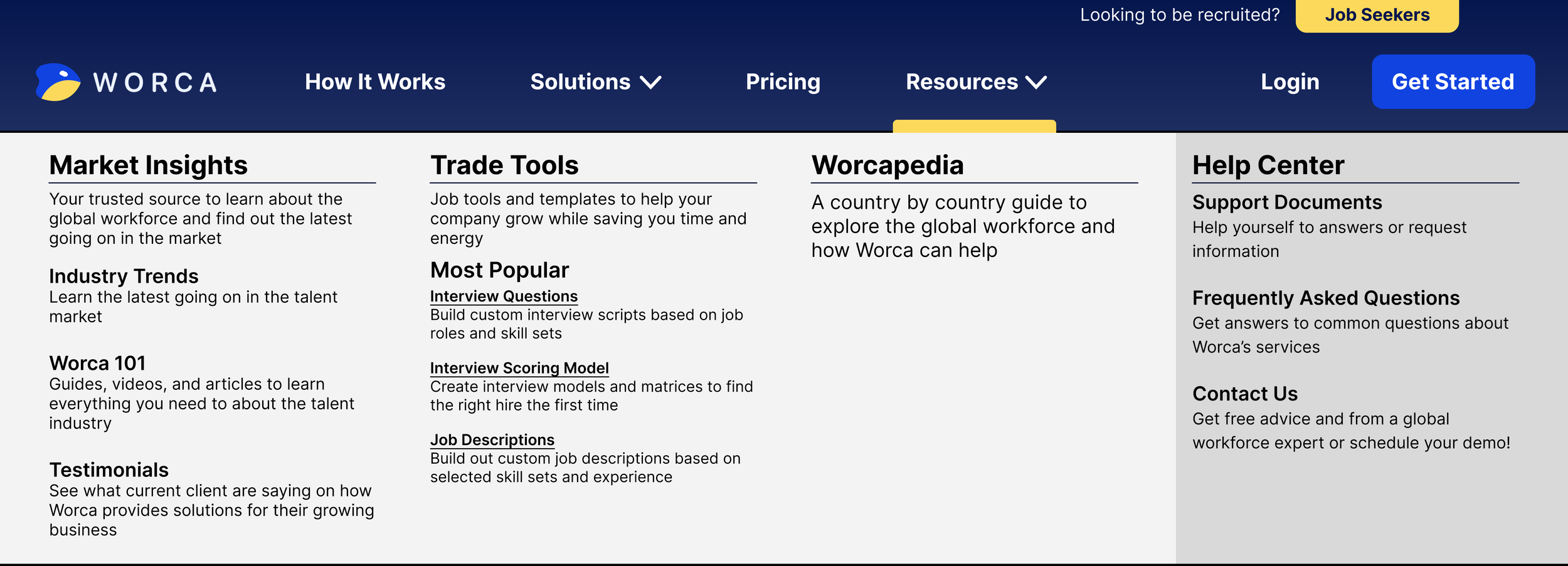
On the Solutions tab, much more significant changes were made:
Summary Text - Adding summary text under each option provides a clear direction for users to take.
Navigation Bar Identifier - Golden tab along the top of the navigation bar options makes it easier to identify what part of the website you are on.
Relocating ‘Who We Serve’ - Keeping services and examples of services within the same umbrella can solve any user confusion of where to go.
Adding Additional Services - Worca’s current design does not list these services without speaking with someone or searching through the site. Adding room to see more capabilities of Worca may not be as essential, but can still provide plenty of value to the user.
Resources Tab
The resources tab provides a similar look and feel to the features added
Categories - Easy to digest information for quick navigation.
Quick access for popular areas - Easy direct access to tools users like to use a lot on the website.
Summary Text - Summary text alleviates any confusion for users unfamiliar with certain options. For example, ‘Worcapedia’ will not be something every user will understand right away what it is.
Help Center - Making the help center a different color helps it to pop for faster reference.
Homepage
Features:
The key change to the homepage is what was uncovered during the research. Defining who Worca is and the value they can provide to the user. This is achieved through rewording the messaging and having a short video about the company.
Updated language to show the user what value Worca can provide, as well as build trust
Contrast created between sections to help organize information more clearly.
A scrolling list of clients who are happy with the services, along with written testimonials to help add trust.
A ‘Worca Difference’ section to provide a quick, clear statement of what makes them better than the competition.
A section that provides high level information of how their services work. Their industry can get complex quickly, so easy to read step by step information can help prevent the user from feeling overwhelmed.
(click on the image to the right to see in full size.)
Pricing Page
The goal of a pricing page redesign was to eliminate confusion and create an interactive experience. These were the guidelines I followed based on research and feedback when designing the page:
Remove a tiered look in exchange for a view to see all available services
Prominently display core services to build trust and show value
Add interaction to the page to show users the ability to customize the services to their specific needs and budget
Adding an option to email an estimate can automatically notify sales team and add the user to a mailing list
The first section reintroduces the core services, services in which every user would receive, front row and center. It is important to establish these first and foremost to help set expectations with the user and to see the value the company will provide.
Directly below this lists out each individual service. Highlights of each service are bullet pointed with key features of the service, along with the cost that can be expected.
Once the user scrolls through the service, they are then prompted to either contact the company, or build a pricing estimate.
The pricing bundle tool allows users to select the services they choose, with selected services highlighted and price listed. Unselected services are greyed out with no price, in order to prevent confusion on the services included in their custom bundle.
The benefit of this tool is that the user can email a quote to themselves so that they can easily review it at a later time. It can also notify the lead to the company’s sales team to have an entry point for a possible new client.
Naturally, many users may have questions so some of the most frequently asked can be found directly on this page. Keeping it on the same page keeps the user engaged on the pricing services, rather than getting redirected to a new page and potentially losing the quote they built.
(click on the image to the right to see in full size.)
Market Insights
Market insights is set to be implemented as a brand new feature and service by Worca. The goal being to design a platform to become the trusted go to source for insights in the global hiring market. Directions for the design include:
Create a dedicated area of content for users new to the space that want to learn from the ground up. This will build trust and add value.
Add the ability to show videos currently trending amongst other users. This can keep content relevant and current to the market.
Content should have the ability to be searched, sorted, and filtered. This allows the users to quickly find what they are interested in and potentially have them on the site for a longer period of time.
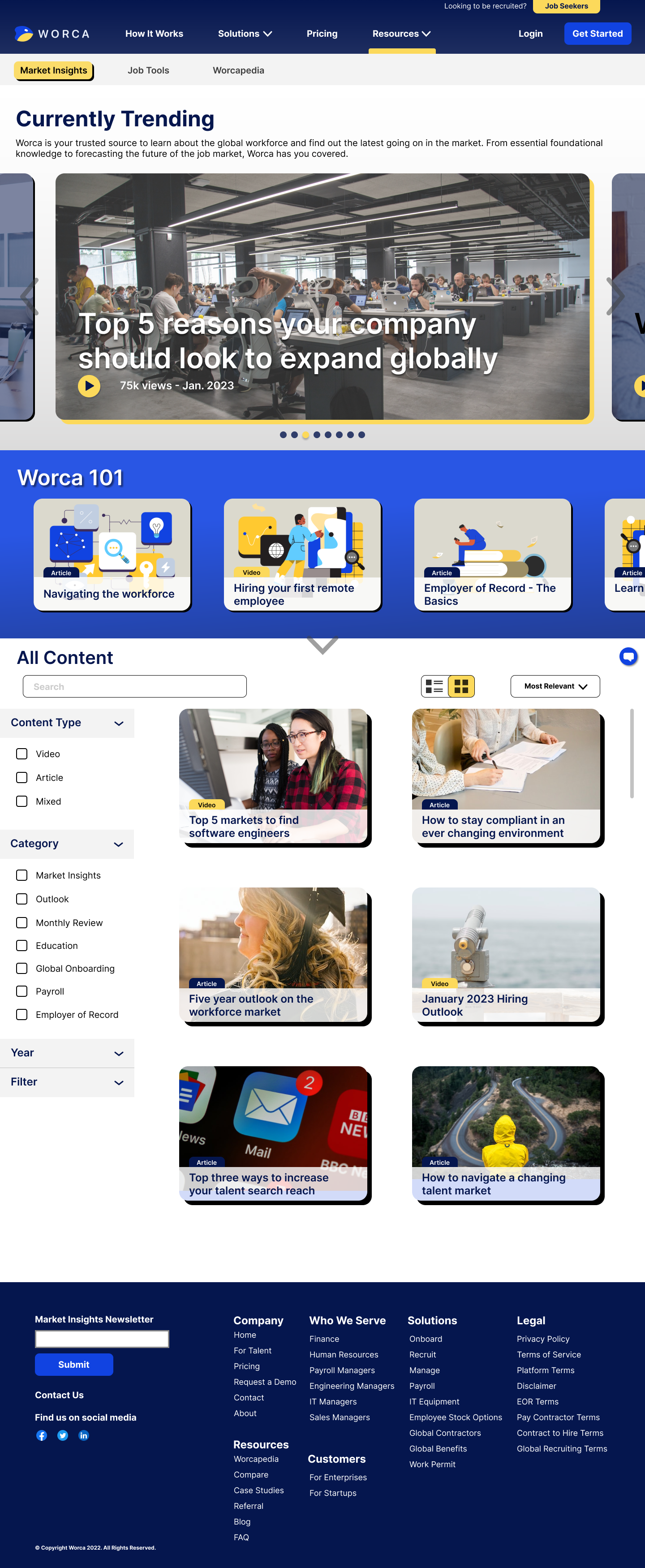
The top navigation displays the three main categories within this section. To help make the user aware of where they are, a golden yellow box highlights their location.
At the top of the page is a carousel of content that is currently trending. This will interest a majority of the users accessing this part of the site, and therefore is high on the hierarchy list.
Directly below that is the 101 section that provides essential content to users new to the industry. It is highlighted in a bright, bold color relevant to the brand so that it will be easily visible.
Below that is the full content list that has both search and filter capabilities. The content tiles also include visual tags that identify the type of content it is. So if the user only wants visual content, they can quickly see what content are videos, or the same would go for written articles.
(click on the image to the right to see in full size.)
CONCLUSION & FINAL THOUGHTS
Overall I was happy with the outcome of the project. I felt the new design captured the needs of the client, and the new design was well received! Ultimately, the redesign has empowered the client to engage with their audience more effectively and drive greater user satisfaction.
One of the biggest challenges that was faced was the overall timeline. There was a strict deadline to complete the project, which meant sacrifices needed to be made during the research phase in order to meet the end goal for the client. It was a great learning experience with understanding how and where to prioritize the research in order to help maximize the end product.
This was also a project where I knew very little about the client’s industry going in to it. The experience overall was very rewarding experience to learn something new while also getting to help the client create a more enjoyable experience on their website.


