FimiMALL
Revamped Shopping App design Prioritizing Convenience and Enhanced Functionality for Users
Scroll ↓
Background
The Client:
FimiMALL is a shopping delivery platform that connects users to their local fashion stores where they can shop multiple stores in the same cart and delivered within 72 hours. They aim to make shopping local stores more accessible and convenient for users with busy lifestyles.
The Objective:
Design a search and filtering user experience to shop on the FimiMALL mobile app.
Deliverables:
A clickable prototype
Design documentation explaining the functionality of the prototype
Research
Research Goals:
Learn about FimiMALL and the goals they want to achieve.
Understand the current customer experience to identify FimiMALL’s value and potential pain points.
Key Questions:
What is the current experience like on the app?
How might we replicate a shopping mall experience from anywhere with a phone?
Research & Exercises Performed:
Stakeholder Interviews
Competitor Research
Heuristic Analysis
User Testing
After first meeting with stakeholder, it was clear the main objective was creating an experience for the user to help them find the right fashion products, as the app’s current functionality was quite limiting to find specific products. I conducted a heuristic analysis of the app to not only see the state of things, but what areas needed to be prioritized to elevate the current user experience. Some key takeaways can be found below the full heuristic analysis.
HEURISTIC ANALYSIS (To see the analysis in full size, please click on the images.)
Key Takeaways
The logo and shopping cart at the top is causing confusion
Add to cart process could be clearer
No ability to save account information
currently no filtering abilities or categories
No ability to save items for later or go back to specific item
Wireframing
The first reason is pretty straightforward and is in line with creating effective search and filtering tools to quickly show the user items relevant to their needs. However, I also really wanted to explore the second reason. While it may be harder to replicate, it can really create an engaging and exciting user experience to make the user to want to shop on the app if executed properly.
The app also did not currently have a main landing screen or home page. It directed you directly into a feed of products. But without any kind of starting point or home base, the user can feel lost. I spent time brainstorming features to give the user any relevant information needed to begin their shopping experience.
Below you can see some initial evolutions of the home page once the sketches got put into Figma.
Two of the top reasons people go to a local shopping area would be:
1. The user is looking for something specific and want to see all their options for that specific item (i.e. blue denim jacket.)
2. The user doesn’t really know what they want, they just want to go shopping and discover what they like based on their style.
(click on the wireframes to see in full size.)
When beginning to brainstorm ideas, I began to research both fashion companies as well as apps providing similar services but in different categories. I wanted to see what type of features and experiences overlap between the two and would be useful to add into the shopping experience.
To go back to one of the key questions, “how could I replicate a shopping experience on an app?”.
Usability Testing
Once the initial concepts got ironed out it was time to get the designs into Figma to further develop and then begin user testing. Usability testing was employed as an essential step in the process to provide valuable insights into the end-users' perspectives, allowing for a better understanding of their needs, expectations, and pain points.
A total of 18 participants were tested over 2 rounds of testing of the app.
3 in-person interviews
15 online users tested usability exercises and answered questions
One of the first things I wanted to test was for the Discover section of the app. I wanted to create an initial setup process to get to understand the users likes, dislikes, style, and rough price range in order to only display products relevant to them.
NAMING STYLE CATEGORIES
It was important that I named style categories things that were current, but also a broad enough spectrum that as many users could connect with something. This was one of my main focuses in testing. I had already done research and created a list of categories myself; however, during the user testing process, I had users list out what they thought to be style categories. I was looking for trends to see what categories were reoccurring answers. Once I had that initial list, I conducted a card sorting exercise to take it a step further to narrow it down to a final list of style categories.
Card sorting test results
One of the other main focuses of the user testing was functionality and ease of use finding products and information. Both in interviews and through online user testing, I created tasks for the user to complete. This was to ensure the language, location, and overall navigation on the app makes sense, or if any changes needed to be made. Below are a few of the ‘initial click’ tests created. These were a set of tests to see based on a given task, where would be the first place the user would think to tap to proceed.
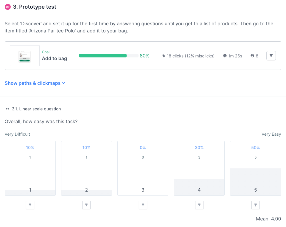
To create more complex tasks, I wanted to see how successful users can be when navigating through the app. Below are some test results when the user was tasked when adding a certain item to their bag.
Overall the testing proved to be very successful. It helped bring awareness to areas of the design that needed more work, and evolve areas of the design to meet the needs of the users.
Solidified filtering categories and styles
100% of online participants were able to navigate through the initial customization feed
Reshaped the home screen to meet user needs and improve navigation flow
In the end, it gave confidence the design elements created would meet the goals set out and the beginning of the project and improve the overall user experience of the app.
Solutions
Another key area was to add a wishlist. Its creates a way for the user to easily go back to items were looking at in past visits to the app. Maybe they needed a second opinion, or waiting for a store sale. I also added the navigation menu to the bottom rather than up top or on the side. The benefit of keeping the navigation at the bottom of the screen makes it easier for users to navigate around the app with one hand. Users today are very mobile and active with their lifestyle. They might have 5 minutes to shop while in line for their lunch, or waiting at an appointment. Any way to make it easier to access full features of the app can benefit the user and more likely to stay engaged with it.
Discover - A curated feed to shop
Discover builds a curated feed based on initial survey questions, and is continuously improved through search history, orders, and items added to their wishlist.
The idea behind this section of the app is to recreate the experience when someone wants to go to the mall and explore what type of new styles and products are out there. Discover gives users the chance to personalize the experience to them, from styles and brands they like, to clothes that fit within their budget.
Home Screen
The build of the app at the time of this project did not feature a Home Screen. Based on research and initial design ideas, it felt necessary to add to the app to give users a starting point. I like to think of it as the directory map when visiting a shopping center for the first time.
As you can see from what is pointed out on the image, I tried to include access to any information you might need right away. Stores you like to frequent, any sales the stores would like to promote, or even if you want to swap your delivery address to somewhere new.
The initial setup screens for Discover walks the user through some personalization selections. They can select any styles they like, brands they connect with, and the typical cost range they like to spend on certain products. The setup for this can benefit both the user and the store or brand. The user is provided a customized feed to shop with products all of which are relevant to what they like. At the same time, many stores or brands that struggle with exposure get the opportunity to be placed in front of a user who may not be familiar with the brand yet.
Shopping Categories
A simplified setup to quickly navigate the user to what they are shopping for.
The shopping section of the app is designed to be a minimal, yet effective experience to easily direct the user to the types of products that they are interested in. A search bar stays up at the top no matter the level of categorization they are in. Products can also be filtered by many different components once they are in the product feed.
Product Feed
A simple, uncluttered feed that adds a lot of value for the user. Multiple functions available direct from the product feed without getting into the full item details page.
Users can quickly add an item to cart with seeing a summarized product detail window. Or they can tap the heart emoji to add it to their wishlist. Sort and filter options are an overlay at the top of the screen to allow access no matter how much the user has already scrolled down on the feed.
Prototype
To see a working demo that includes animations and full features of the app design, click on the image below to be directed to the prototype of the app:
Conclusion & Final Thoughts
With the introduction of advanced search algorithms and smart product recommendations, users now have the ability to effortlessly discover relevant products, tailored to their preferences. The intuitive interface and improved navigation have fostered a seamless browsing experience, empowering users to effortlessly explore a vast range of products.
The success of the design was certainly not without its challenges. Shopping and fashion is a very personal experience, and everyone’s style is unique. Usability testing was certainly critical to create a shopping experience within an app that was both clear and enjoyable. On a personal level, it really pushed my growth using Figma to create things like loading animations and functioning sliders bars.
As a whole I think this project was a great success. It met the minimal aesthetic the stakeholders wanted to achieve while still incorporating the brand colors. The design has created ways for users to interact and engage with their shopping experience. By adding a multitude of new features, the app has seamlessly integrated convenience, personalization, and efficiency into one cohesive platform.


